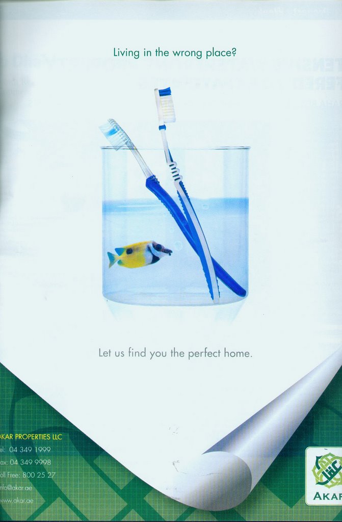
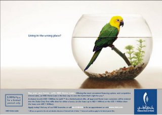
saw some similarities in these two campaigns in terms of art direction, logo is bottom right on both ads. Most of the copy is on the bottom of the ad. Both ads are predominantly white. Then again it might be a stretch...
posted by Nic at 2:04 PM
![]()
![]()

9 Comments:
anyone know the agencys?
its now down to .. which ran first?
NBDs is the original. I remember seeing the latter pretty recently.
NBS is Leo Burnett, as for the second one, haven't got a clue...but if I had to guess, FACE TO FACE!
I doubt very much that any of them copied off the other. They just applied the same overused thought patterns and got the same results. hardly surprising. I'd blame it on lack of originialty.
Based on your last point.
You obviously didn't read the ads anonymous 2.
Yours truely
Anonymous 3
Can you explain further Anonymous 3
Both ads carry the exact same idea.
They have used exactly the same headline anonymous 2.
That's the point A3.
Both ads used the same Idea (which is the headline and the visual, or is the headline not part of the idea A3?!?!?!?!?)
What i'm saying is:
Both agencies tried cracking this brief using very similiar apporaches and that's why they ended up having the exact same solutions i.e. ads. Both agencies said: What viusal pun can we use here to dramatize the USP? AHA! lets show something living in a place where it doesn't usually live! brilliant!
The idea wasn't ripped off. Its just an old trick in the book that two agencies used at the same time.
Post a Comment
<< Home